

Blogs
Best Colours for Exhibition Booth Graphics: How to Choose Colours That Attract Visitors

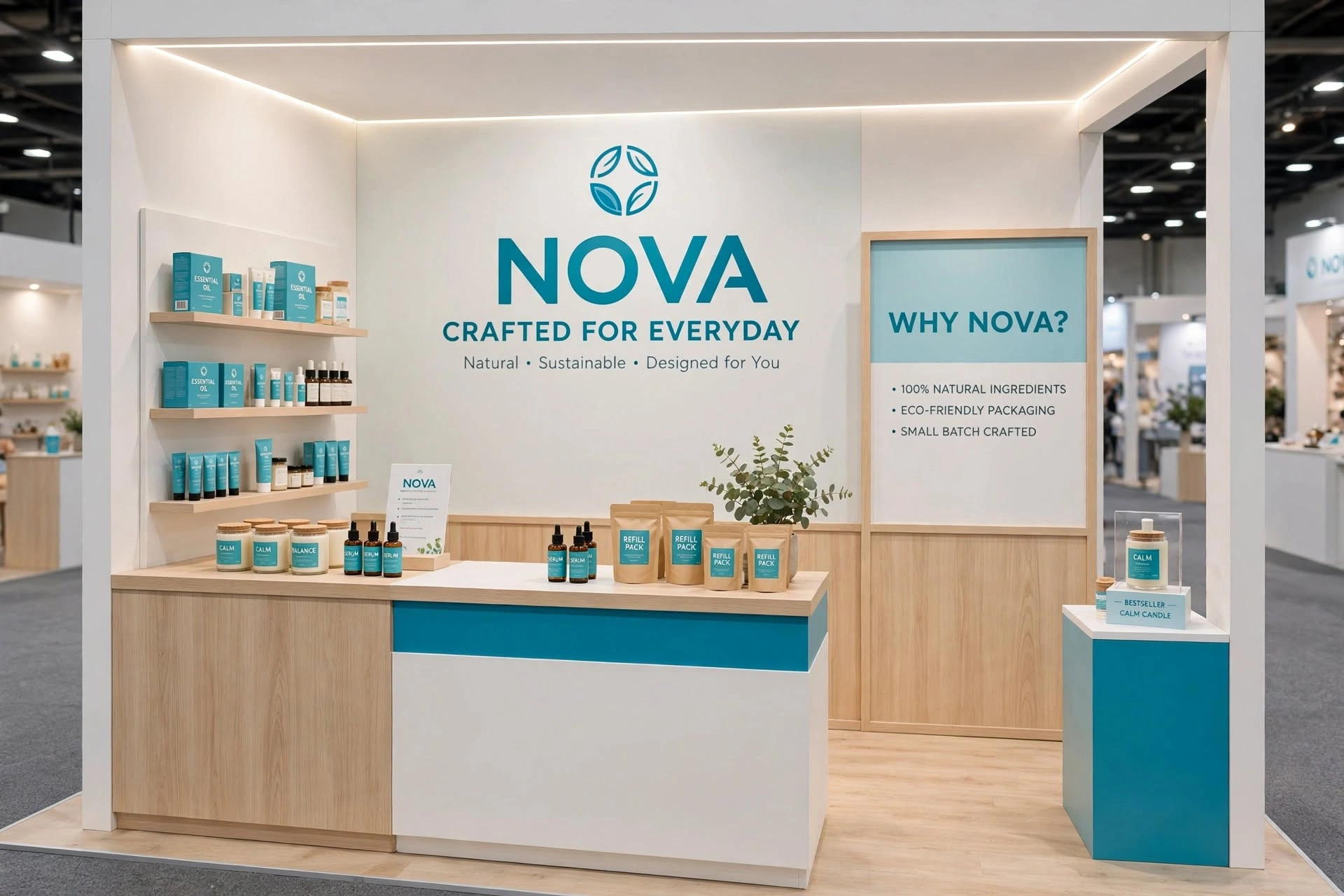
Colour is one of the most powerful visual elements in exhibition booth design. Before a visitor reads a headline, studies a product display, or speaks with a member of your team, they are likely to notice the overall appearance of your stand. The right colour combination can make an exhibition booth easier to recognise, more professional, more inviting, and more memorable.
For businesses exhibiting in the UAE, colour selection becomes even more important because major events can place hundreds of brands in the same exhibition hall. Events at Dubai World Trade Centre (DWTC), Expo City Dubai, Abu Dhabi National Exhibition Centre (ADNEC), and other UAE venues bring together companies from technology, construction, healthcare, real estate, hospitality, food, retail, manufacturing, finance, energy, and many other industries.
Effective exhibition graphics should therefore do more than look attractive. They should communicate brand identity, create visual hierarchy, improve readability, support visitor navigation, and help a business stand out without creating visual clutter.
Why Colour Matters in Exhibition Booth Graphics
Colour can influence how people perceive a brand and how quickly they notice an exhibition stand.
In a busy exhibition environment, visitors are constantly exposed to competing messages. Strong colour contrast can help important information remain visible from the aisle, while a consistent palette can reinforce brand recognition.
Colour can be used to distinguish:
Branding areas, product displays, reception counters, meeting spaces, promotional messages, digital screens, directional signs, and architectural features.
The best exhibition booth does not necessarily use the brightest colours. Instead, it uses colour strategically.
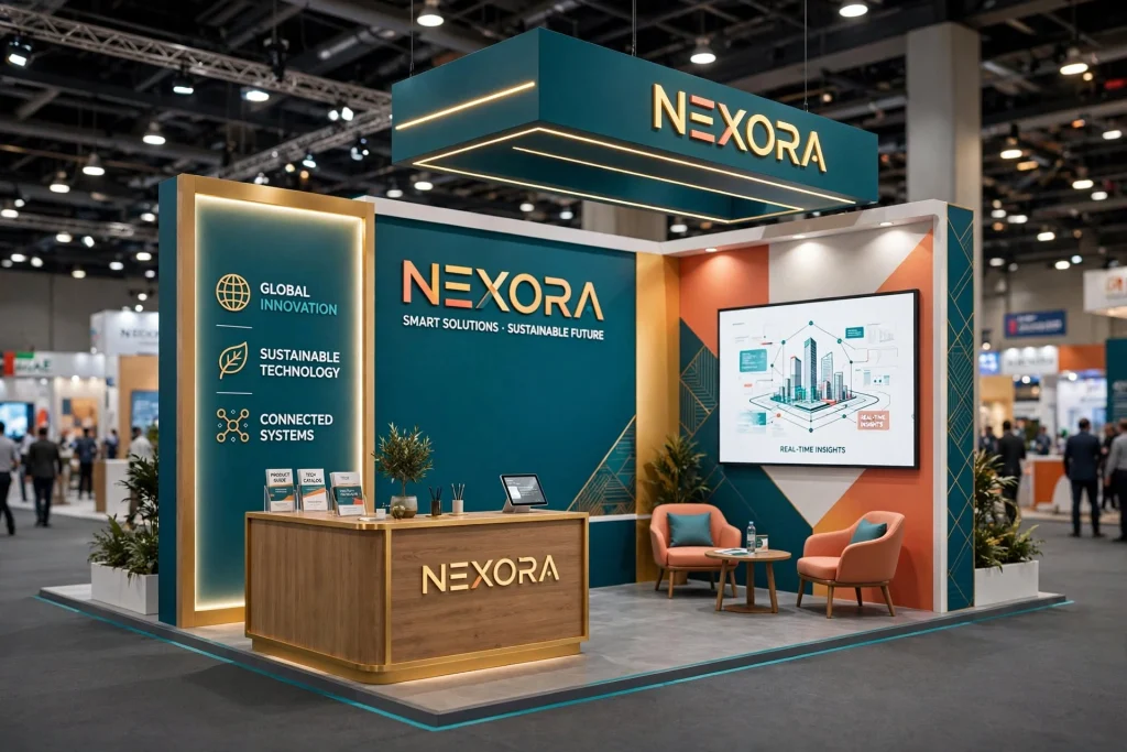
Start With Your Existing Brand Identity
The first consideration should usually be the company’s existing visual identity.
If your business already has established brand colours, your exhibition booth should generally reflect them.
Brand consistency across your:
Website, logo, packaging, brochures, social media, uniforms, signage, digital content, and exhibition stand
helps visitors recognise the company across different marketing channels.
However, brand colours do not have to cover every surface.
A primary brand colour can be combined with neutral backgrounds and secondary colours to create a more sophisticated environment.
White for Clean and Modern Exhibition Designs
White is one of the most versatile colours for exhibition graphics.
It can create a feeling of:
Cleanliness, simplicity, openness, modernity, and professionalism.
White backgrounds can be particularly effective for technology, healthcare, architecture, interior design, professional services, and premium brands.
White also provides excellent flexibility for displaying coloured logos, photographs, product graphics, and digital screens.
However, an entirely white booth can sometimes appear flat if there is insufficient contrast or architectural detail.
Lighting, texture, graphics, and accent colours can add depth.
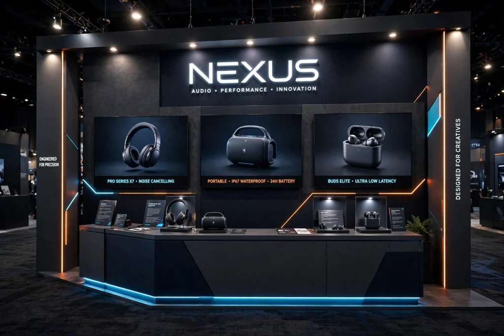
Black for Luxury and Premium Branding
Black can create a strong sense of sophistication and premium positioning.
It can work particularly well for:
Luxury products, automotive brands, fashion, technology, hospitality, premium services, and high-end real estate.
Black backgrounds can make illuminated logos and digital displays highly prominent.
However, too much black may make a small booth feel visually heavy.
A balanced approach can combine black with white typography, metallic finishes, brand colours, or carefully positioned lighting.
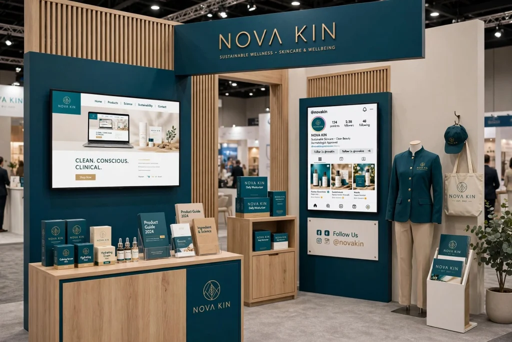
Blue for Trust and Professionalism
Blue is commonly associated with:
Trust, reliability, technology, communication, stability, and professionalism.
This makes blue a popular choice for businesses in:
Technology, finance, engineering, healthcare, telecommunications, cybersecurity, logistics, and professional services.
Different shades produce different impressions.
Dark blue can create a corporate and established appearance, while lighter blue can feel more open and contemporary.
Blue also works effectively with white, grey, and selected accent colours.
Red for Energy and Attention
Red is visually powerful and can attract attention quickly.
It is often associated with:
Energy, urgency, passion, excitement, and action.
Red can be useful for promotional messages, product launches, limited-time offers, or selected architectural features.
However, using large amounts of intense red can become overwhelming.
A better strategy is often to use red as an accent colour against a neutral or lighter background.
Green for Sustainability and Natural Brands
Green can communicate associations with:
Nature, sustainability, health, environmental responsibility, agriculture, wellness, and renewable energy.
It can be particularly suitable for companies exhibiting products or services related to:
Renewable energy, sustainable construction, organic products, environmental technology, landscaping, wellness, and green building.
Different shades can create very different results.
Deep green can feel premium and established, while softer greens can create a more natural and relaxed environment.
Orange for Friendly and Dynamic Brands
Orange can create an energetic and approachable visual identity.
It can be useful for brands that want to communicate:
Creativity, enthusiasm, friendliness, innovation, and accessibility.
Orange works well as an accent against white, dark grey, navy, or neutral backgrounds.
It can highlight important elements such as:
Call-to-action messages, product features, reception counters, arrows, promotional graphics, and interactive areas.
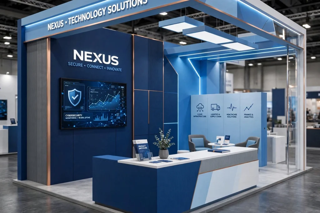
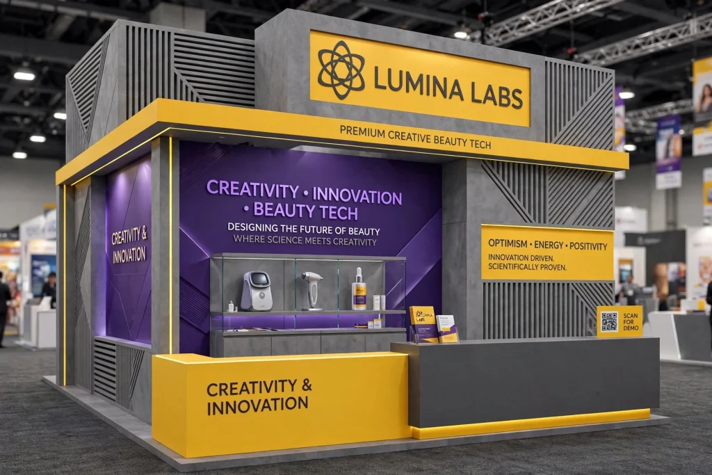
Yellow for Visibility and Optimism
Yellow is highly visible and can create associations with:
Optimism, energy, creativity, warmth, and positivity.
It can attract attention in an exhibition environment, but it needs careful contrast management.
Dark text on an appropriately selected yellow background can improve readability, while very bright yellow combined with small white text can create accessibility problems.
Yellow is often most effective as an accent rather than the dominant colour across an entire booth.
Purple for Creativity and Innovation
Purple can communicate:
Creativity, imagination, premium positioning, technology, and individuality.
It can be particularly interesting for brands in creative industries, beauty, technology, entertainment, and innovative consumer products.
Purple can also be combined with white, black, silver, or selected brand colours to create a distinctive exhibition environment.
Grey for Corporate and Architectural Designs
Grey is an excellent supporting colour for exhibition graphics.
It can communicate:
Professionalism, balance, sophistication, neutrality, and modern architecture.
Grey is particularly useful when the booth already contains strong brand colours.
For example, a company may use grey as the architectural background while using its primary colour for logos, product graphics, and key messaging.
This creates visual hierarchy without making the booth overly colourful.
Beige and Earth Tones for Hospitality Brands
Warm neutrals such as beige, sand, taupe, and natural brown can create a welcoming environment.
These colours can work well for:
Hospitality, interior design, furniture, food, lifestyle, real estate, architecture, and luxury residential brands.
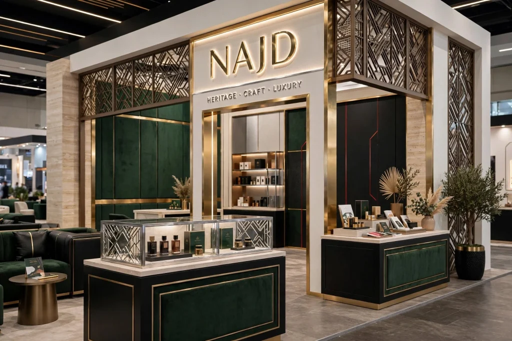
For UAE exhibitions, warm neutral palettes can also complement materials such as wood, stone, brass, and textured finishes.
Metallic Colours for Premium Exhibition Stands
Gold, silver, bronze, and metallic finishes can create a premium visual effect.
They can be incorporated through:
Printed graphics, lettering, architectural details, counters, product displays, decorative elements, and illuminated signage.
Metallic colours should generally be used carefully.
Too much metallic detailing can make a booth appear excessive, while selective use can reinforce a premium brand identity.
UAE-Inspired Colour Palettes
Businesses targeting customers in the UAE can incorporate regional visual influences without relying on clichés.
A sophisticated UAE-inspired palette might use:
White, deep green, red, black, sand, gold, or neutral architectural tones.
However, the company’s own brand identity should remain the primary consideration.
Regional colour references should support the business rather than make the booth look disconnected from the corporate identity.
Choosing Colours According to Industry
Different industries often have different visual expectations.
Technology and IT
Technology companies often use combinations of:
Blue, white, black, grey, purple, and cool accent colours.
LED screens and illuminated graphics can complement these palettes.
Healthcare
Healthcare brands frequently benefit from:
White, blue, green, and soft neutral colours.
The goal is often to communicate cleanliness, trust, professionalism, and calmness.
Construction and Engineering
Construction and engineering companies may use:
Dark blue, orange, yellow, grey, black, and industrial neutrals.
High-contrast colours can work well for technical diagrams and project graphics.
Real Estate
Real estate brands can use:
Black, gold, white, beige, deep blue, green, and other premium tones.
Large architectural photographs and project visualisations should influence the overall palette.
Hospitality
Hotels and hospitality businesses may benefit from:
Warm neutrals, gold, bronze, deep green, burgundy, navy, or natural colours.
The objective is often to create an atmosphere rather than simply communicate technical information.
Food and Beverage
Food brands can use colour strategically to make products appear visually appealing.
Fresh, vibrant colours can support product recognition, while natural tones can reinforce organic or premium positioning.
Use Contrast to Improve Visibility
Colour contrast is essential for exhibition graphics.
A beautiful colour combination can still fail if visitors cannot read the text.
For example, small light-grey text on a white background may be difficult to read from even a short distance.
Important information should have sufficient contrast against its background.
Contrast should be considered for:
Headlines, body text, logos, product labels, directional signs, QR codes, and digital displays.

Dark Backgrounds With Bright Branding
Dark backgrounds can make selected visual elements stand out.
A black, navy, or dark-grey wall can provide a strong foundation for:
Illuminated logos, white typography, LED displays, product photography, and bright accent colours.
This approach can create a dramatic appearance.
However, the booth should still maintain sufficient ambient lighting for visitors to navigate comfortably.
Light Backgrounds With Bold Branding
Light backgrounds create a clean visual environment.
A white or light-grey wall can allow strong brand colours to stand out.
This approach is particularly useful when the business has a distinctive corporate colour.
It also gives photographs, product displays, and digital screens a neutral background.
Don’t Use Too Many Colours
One common exhibition design mistake is using too many unrelated colours.
A booth containing six or seven competing colours can become visually confusing.
A practical approach is to establish:
One primary colour, one or two supporting colours, and neutral tones.
This creates consistency while providing enough flexibility for different graphics.
The exact number depends on the brand and design concept, but simplicity generally improves visual communication.
Colour and Visitor Psychology
Colour can influence perception, but it should not be treated as a guaranteed psychological formula.
People respond to colour according to culture, context, personal experience, industry expectations, and surrounding visual elements.
Therefore, businesses should avoid selecting colours solely because a particular colour supposedly guarantees sales.
Instead, colour should support the company’s identity and communication strategy.
Colour and Exhibition Lighting
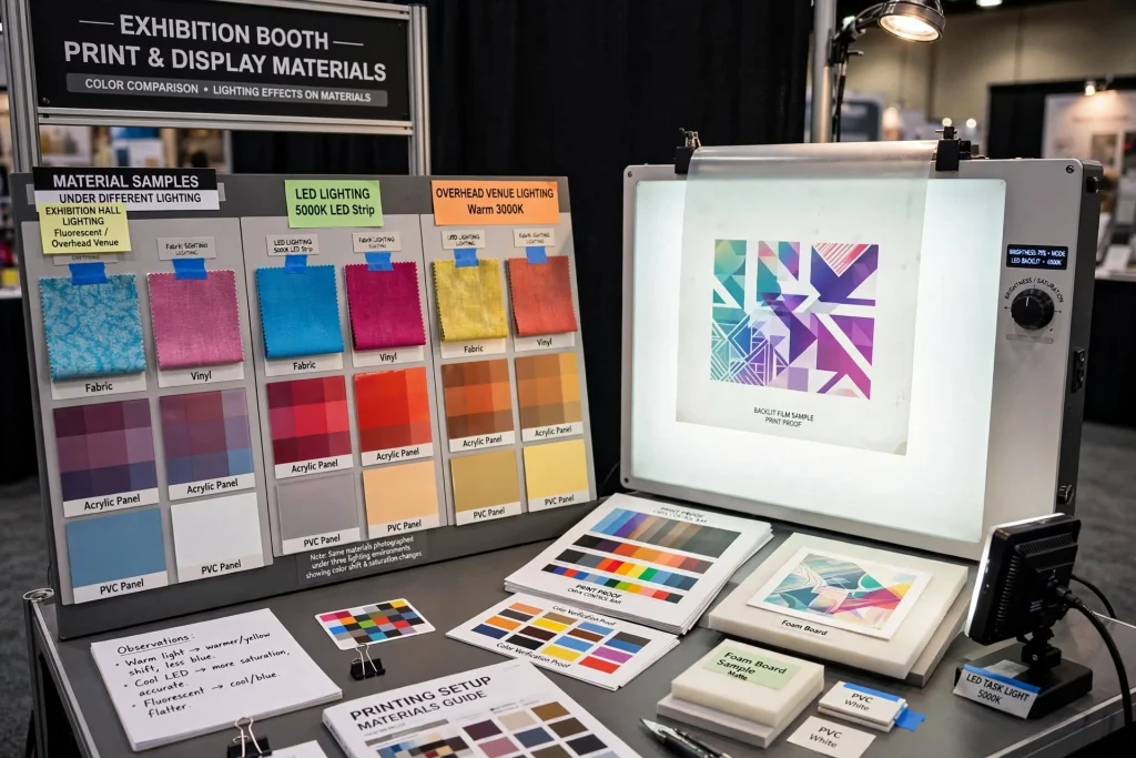
The appearance of printed graphics can change significantly under exhibition-hall lighting.
LED lighting, overhead venue lighting, coloured illumination, and digital displays can all affect how colours are perceived.
A colour that looks excellent on a computer monitor may appear different when printed on:
Fabric, vinyl, acrylic, PVC panels, foam board, backlit film, or other exhibition materials.
Physical samples and print proofs can help ensure colour consistency.
Backlit Graphics and Colour Selection
Backlit graphics require specific consideration.
Light passes through the printed material, potentially changing the perceived brightness and saturation of colours.
Graphics intended for illuminated lightboxes should therefore be prepared specifically for backlit applications.
The printing method, fabric or film, lighting intensity, and graphic density can all influence the final result.
Colour for Digital Exhibition Displays
Digital screens can reproduce vibrant colours that printed materials cannot.
However, the screen content should remain consistent with the booth’s physical graphics.
A business should avoid having:
One colour palette on the walls, another on the LED screen, and a third on brochures.
Visual consistency creates a stronger brand experience.
Colour Coding Different Products
Businesses with multiple product categories can use colour coding to help visitors navigate the stand.
For example:
Blue for software, green for sustainability products, orange for services, and grey for technical solutions.
This approach can make large product portfolios easier to understand.
Colour coding should be accompanied by labels so that information remains understandable even for visitors who cannot distinguish certain colours.
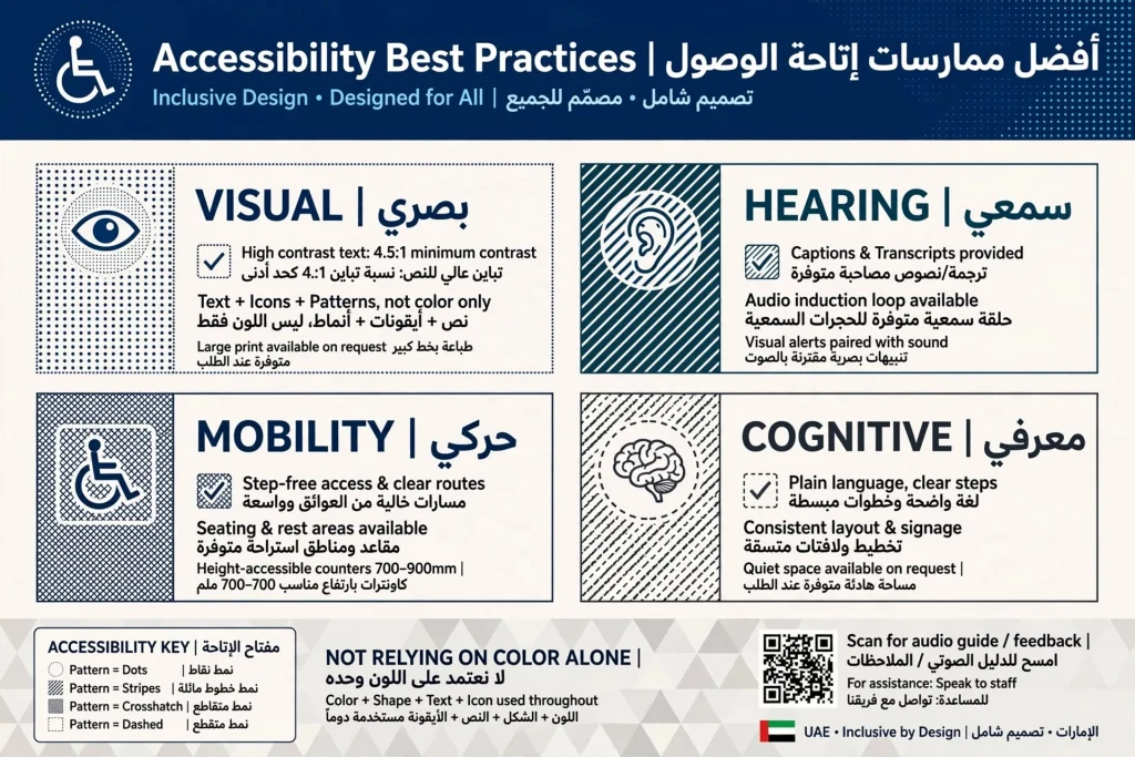
Accessibility and Colour Choices
Accessibility should be considered when creating exhibition graphics.
Important information should not depend solely on colour.
For example, a product category should not be identified only by a red or green label.
Text, icons, patterns, or clear labels can provide additional information.
Typography should also have sufficient contrast against its background.
Colour and Arabic-English Exhibition Graphics
Many UAE exhibitions serve audiences who communicate in both Arabic and English.
When bilingual graphics are used, colour contrast should remain consistent across both languages.
Arabic and English typography can have different visual weights, so the design should be tested at actual viewing sizes.
The objective is to make both languages easy to read without creating an overly crowded layout.
Exhibition Booth Colour Trends in Dubai
Dubai’s exhibition environment often features sophisticated, technology-driven booth designs.
Current design approaches commonly combine:
Neutral architectural backgrounds, strong brand colours, LED lighting, digital displays, illuminated signage, textured materials, and carefully controlled accent colours.
However, following a trend should not take priority over brand recognition.
A distinctive brand with a simple colour system can often be more memorable than a booth that follows every current design trend.
Colour Selection for Small Booths
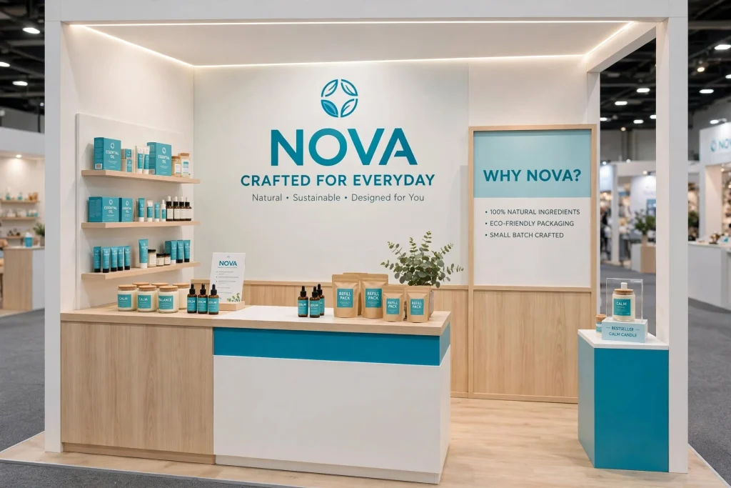
Small exhibition booths can benefit from lighter backgrounds and carefully selected accent colours.
A light palette can make the space feel more open.
Strong brand colours can then be used for:
Headlines, counters, logos, product displays, and key architectural features.
Using a single dark colour across every wall can sometimes make a small booth feel smaller.
Colour Selection for Large Booths
Large booths provide more room for visual zoning.
Different areas can use different supporting colours while maintaining one overall brand identity.
For example, a large technology stand could have:
A dark branded entrance, a neutral product demonstration zone, a bright interactive area, and a premium meeting space.
The colours should still share a coherent visual relationship.
Matching Booth Graphics With Flooring and Furniture
Colour selection should not stop at the walls.
The final appearance also depends on:
Flooring, furniture, counters, lighting, ceiling structures, product displays, staff uniforms, and digital screens.
A strong booth design considers all these elements together.
For example, a neutral floor can prevent the visual environment from becoming too busy when the walls already contain strong brand colours.
Using Colour to Guide Visitor Flow
Colour can help direct visitors through a booth.
A particular accent colour can identify:
Reception, product demonstrations, meeting rooms, promotional areas, or interactive displays.
This can create a subtle navigation system.
However, physical layout and signage should still make the visitor journey understandable without relying entirely on colour.
Creating a Memorable Brand Experience
The ultimate goal of exhibition graphics is not simply to make a booth colourful.
It is to create a memorable brand experience.
Visitors should be able to associate the booth with:
The company name, product category, key message, distinctive visual identity, and quality of interaction.
Colour can act as a visual thread connecting all these elements.
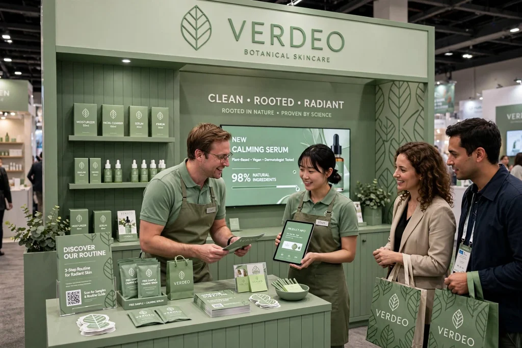
When the same palette appears across the booth, staff clothing, brochures, digital displays, packaging, and promotional materials, the brand becomes easier to recognise.
Common Colour Mistakes in Exhibition Booths
Several colour-related mistakes can reduce the effectiveness of a stand.
These include:
Using too many colours, insufficient text contrast, ignoring existing brand guidelines, relying on trends, using low-quality printed graphics, overusing bright colours, ignoring lighting conditions, and creating inconsistent digital and physical branding.
Another common mistake is choosing colours without considering the surrounding exhibition hall.
A colour that looks distinctive in isolation may disappear when placed next to dozens of similarly coloured booths.
Professional Exhibition Booth Services
Businesses preparing for trade shows can benefit from professional Exhibition Booth Services that integrate graphic design, printing, signage, lighting, display structures, digital screens, counters, and installation.
A professional approach can help ensure that the selected colours work across different materials and viewing distances.
It can also help coordinate the booth with venue requirements and the company’s wider marketing identity.
How to Test Your Exhibition Booth Colours
Before production, review the colour palette at several scales.
Check how the design looks:
From across the aisle, from several metres away, at the reception counter, on printed brochures, on digital screens, and under artificial exhibition lighting.
Print samples can be particularly useful.
The colour should remain recognisable and readable when translated from the original design file into the actual exhibition materials.
Final Thoughts
The best colours for exhibition booth graphics are not necessarily the brightest or most fashionable colours. They are the colours that communicate the company’s identity, create strong contrast, support readability, attract the appropriate audience, and work effectively with the booth’s architecture and lighting.
For UAE businesses exhibiting at venues such as Dubai World Trade Centre, Expo City Dubai, and ADNEC, strategic colour selection can make an important difference in a crowded exhibition environment.
A successful palette usually combines the company’s existing brand identity with carefully selected supporting colours and neutral tones. It should also account for print materials, illuminated graphics, digital displays, Arabic-English communication, furniture, flooring, lighting, and visitor movement.
Whether a business is exhibiting at a technology conference, construction exhibition, healthcare event, food trade show, real estate exhibition, or hospitality event, colour should be treated as part of the complete communication strategy.
When branding, graphics, lighting, signage, digital displays, and visitor experience work together, the exhibition booth becomes more than a display. It becomes a physical expression of the brand that can attract attention, communicate value, and create stronger connections with potential customers and business partners.